

Greenlight Guru LinkedIn Ads
Project Type
Display Advertising
Role
Graphic Designer
Software Used
Adobe Illustrator / Adobe Photoshop / Figma
The Project
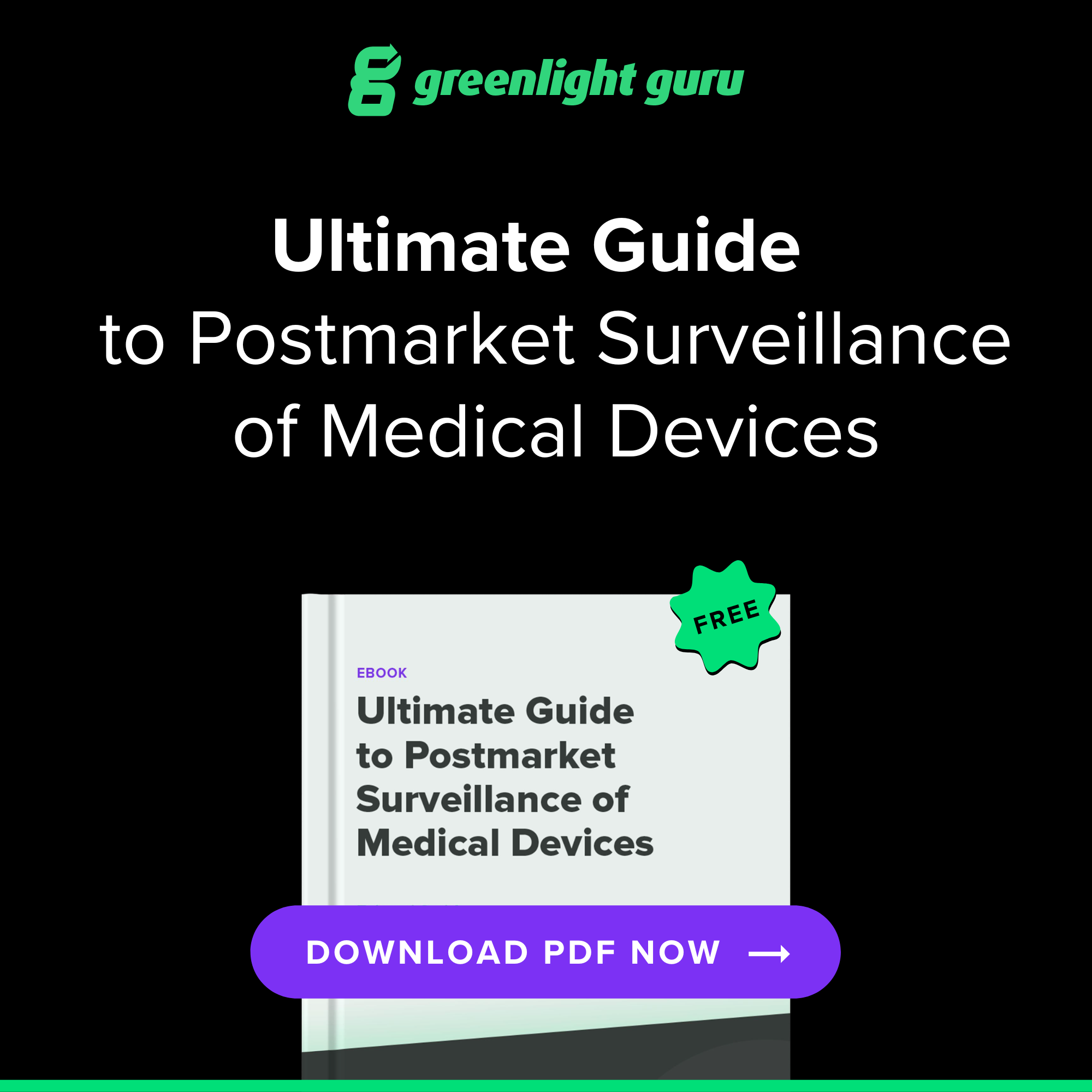
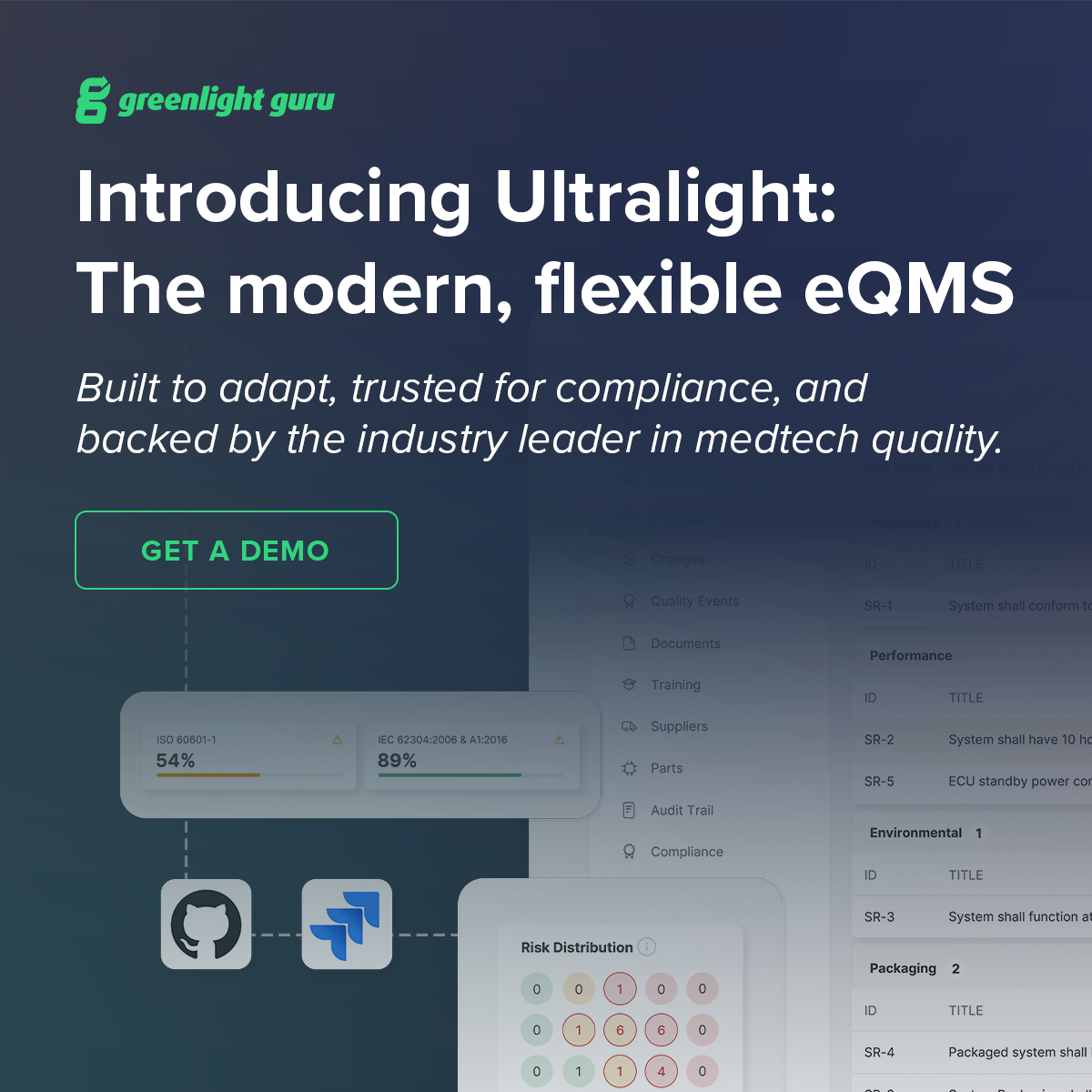
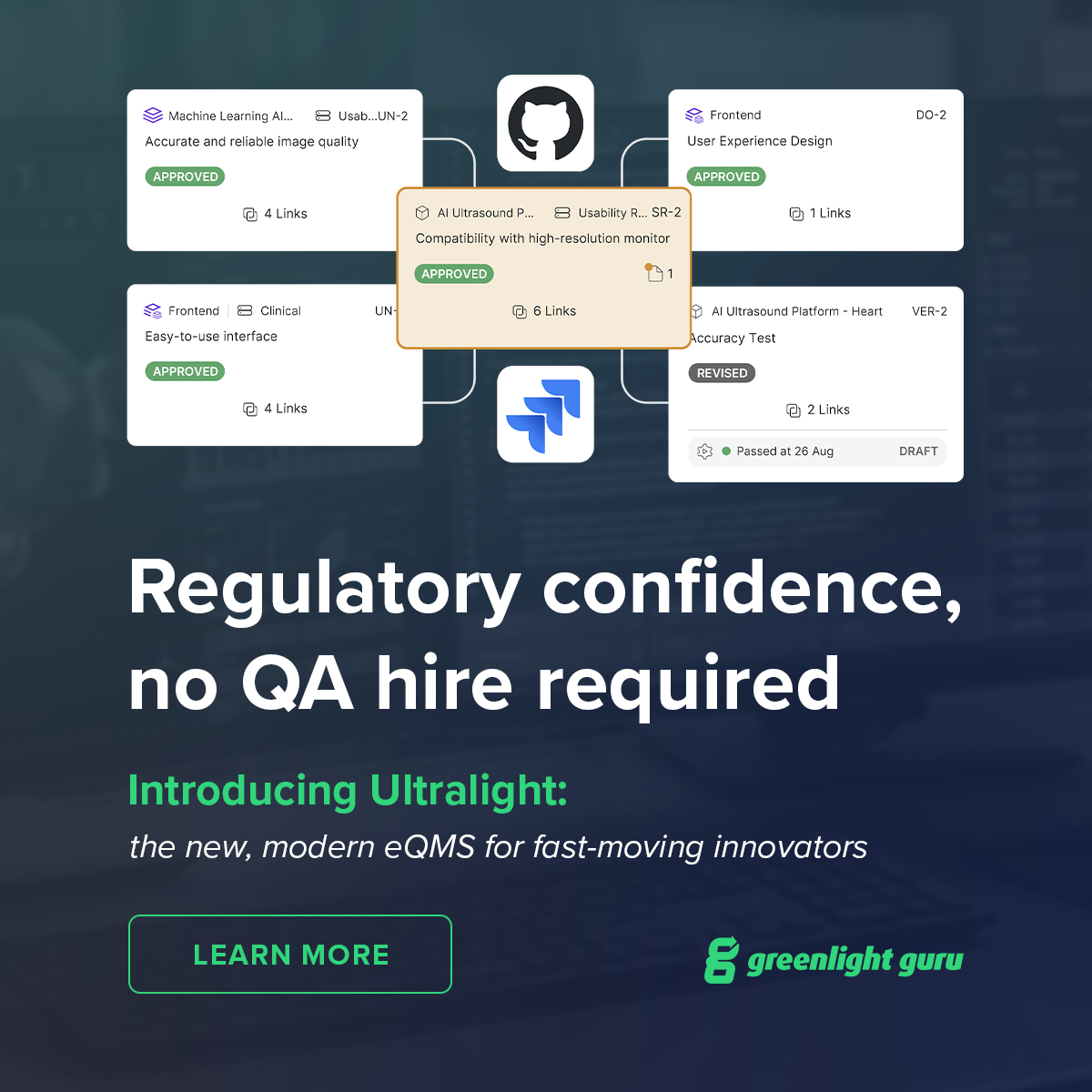
As part of Greenlight Guru’s product marketing efforts, I created a campaign of several LinkedIn display ads to introduce Ultralight, the company’s modern, flexible eQMS platform. The campaign was developed as an evolution of previous product ads that had seen limited engagement, with the goal of creating more compelling, visually engaging creative.
Greenlight Guru also conducted customer messaging research through Wynter, which showed that customers strongly resonated with the project imagery featured on the website. I incorporated that insight into much of the campaign, making product and project imagery a prominent part of the creative while developing multiple messaging and CTA variations.
The Results
The updated campaign generated 38.4K impressions, 171 link clicks, and a 0.45% click-through rate, representing a stronger response than the previous product-focused ads. The campaign also established a cohesive visual approach for promoting Ultralight, combining customer research with product-focused storytelling.
Prior Struggles
1. Unclear Value Proposition
The previous ads focused primarily on describing what the product was, without clearly communicating the benefits or giving viewers a reason to care. The messaging needed to shift from simply explaining the product to highlighting how it could solve real challenges for customers.
2. Difficult-to-Understand Product Imagery
Product screenshots were either missing or presented in ways that made them difficult to see and understand at a glance. Some ads also relied on generic stock photography that felt disconnected from the product. The new approach needed to make the actual product more visually prominent and immediately understandable.
3. Inconsistent Brand Presentation
The previous ads lacked a consistent visual system, with variations in color, imagery, and overall presentation. Some color combinations also created accessibility and legibility issues. A more cohesive approach was needed to create stronger brand recognition and ensure the ads were clear and accessible across the campaign.